1. REFERENCE
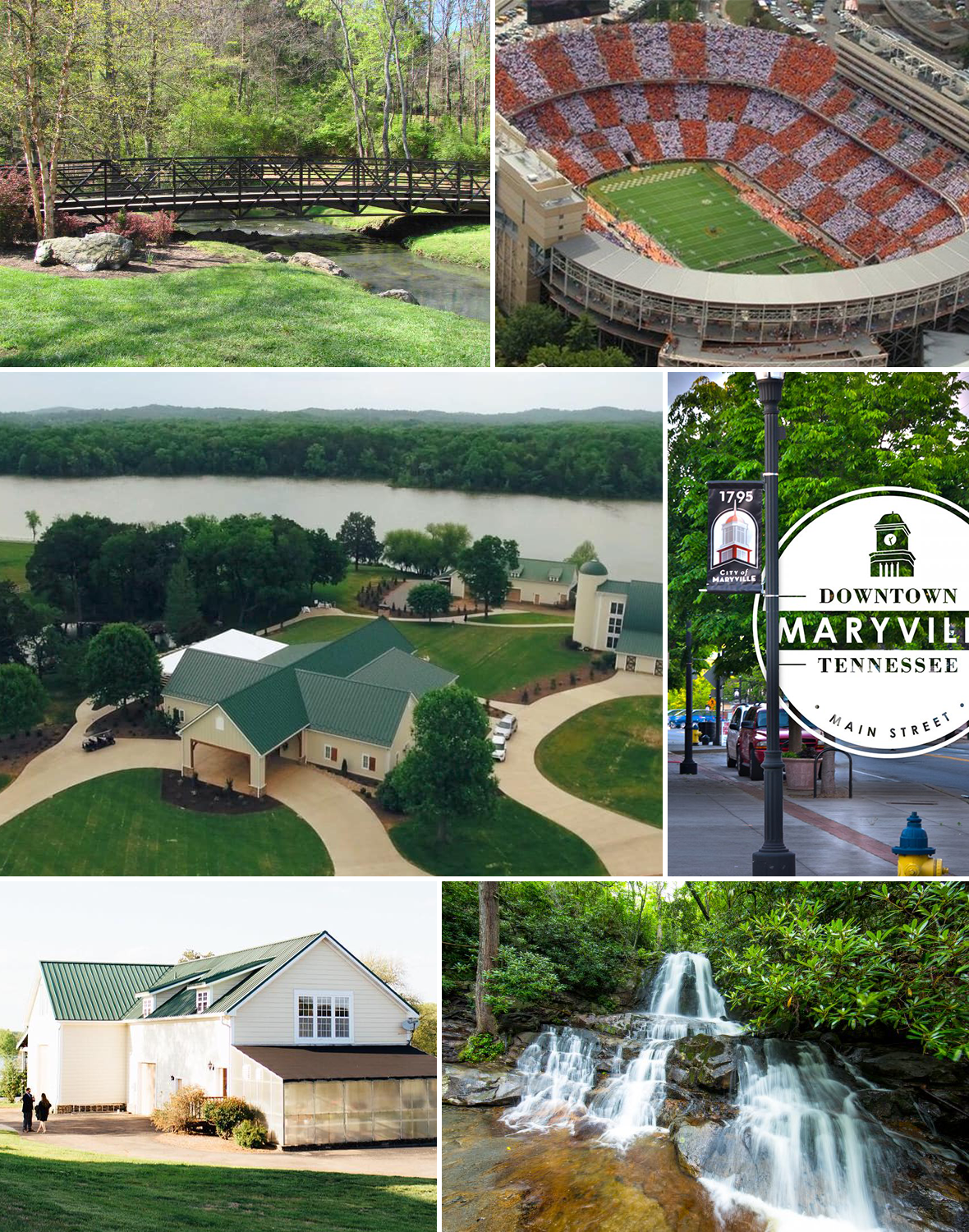
Images of all locations and icons are gathered. These can be provided by the client, but I almost always supplement with some different angles to help visualize the whole location. Also good to have options in case one angle doesn't work as well.
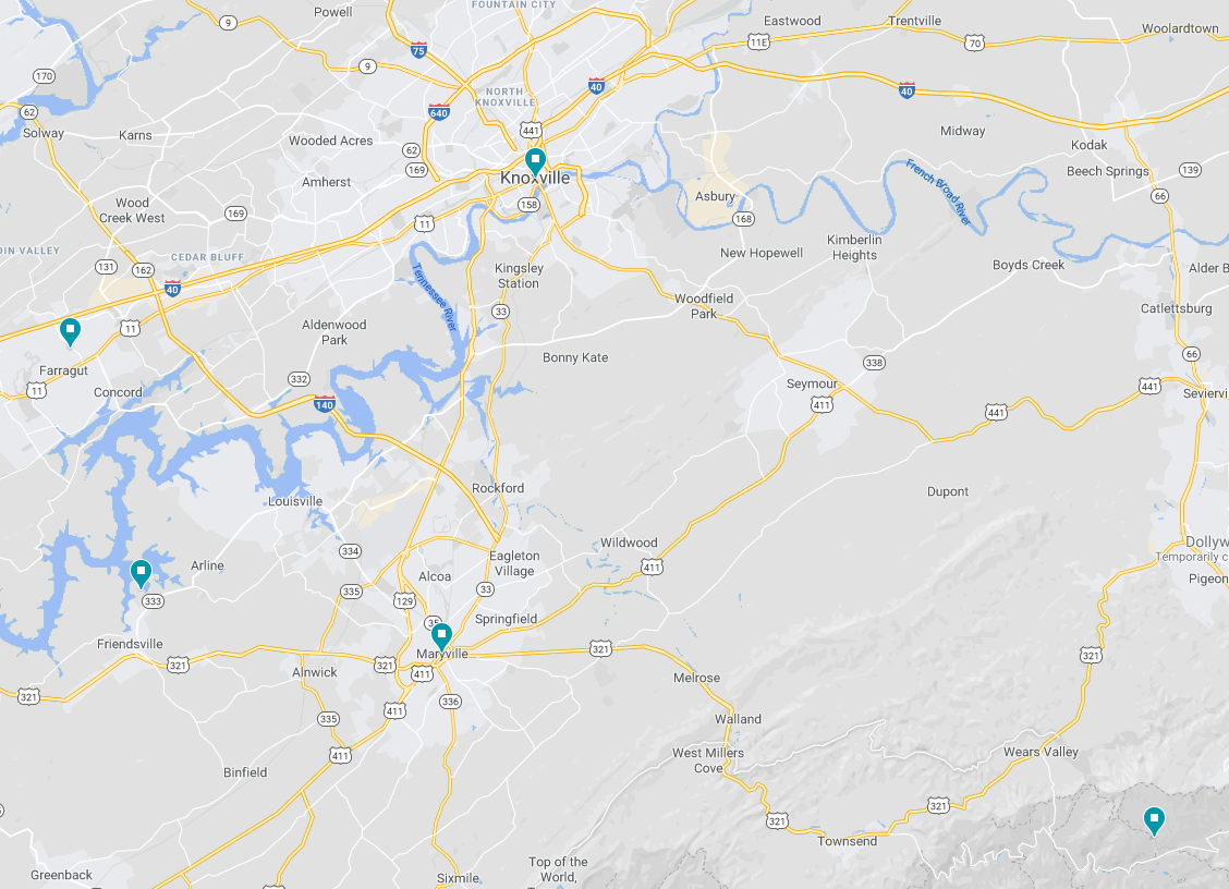
2. MAP PLOTTING
The first step is to always get a map and highlight all the roads, locations, and major features like lakes and rivers that may be included. This step is just for my initial reference and never shared, as the drawn map is going to be exaggerated a bit to fit everything in a more pleasing manner.
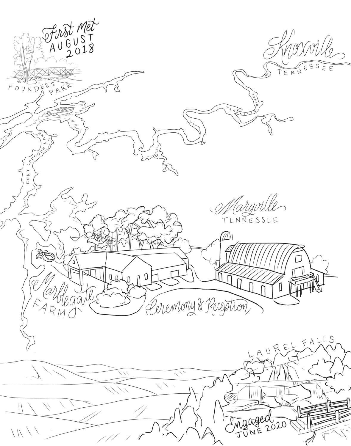
3. INITIAL DRAFT
The first draft is a rough draft. It may be a digital or pencil sketch or combination. The important step here is the establish the layout, sizing, and check all the wording. I usually try not to get too into details here unless I feel it's needed for clarification.
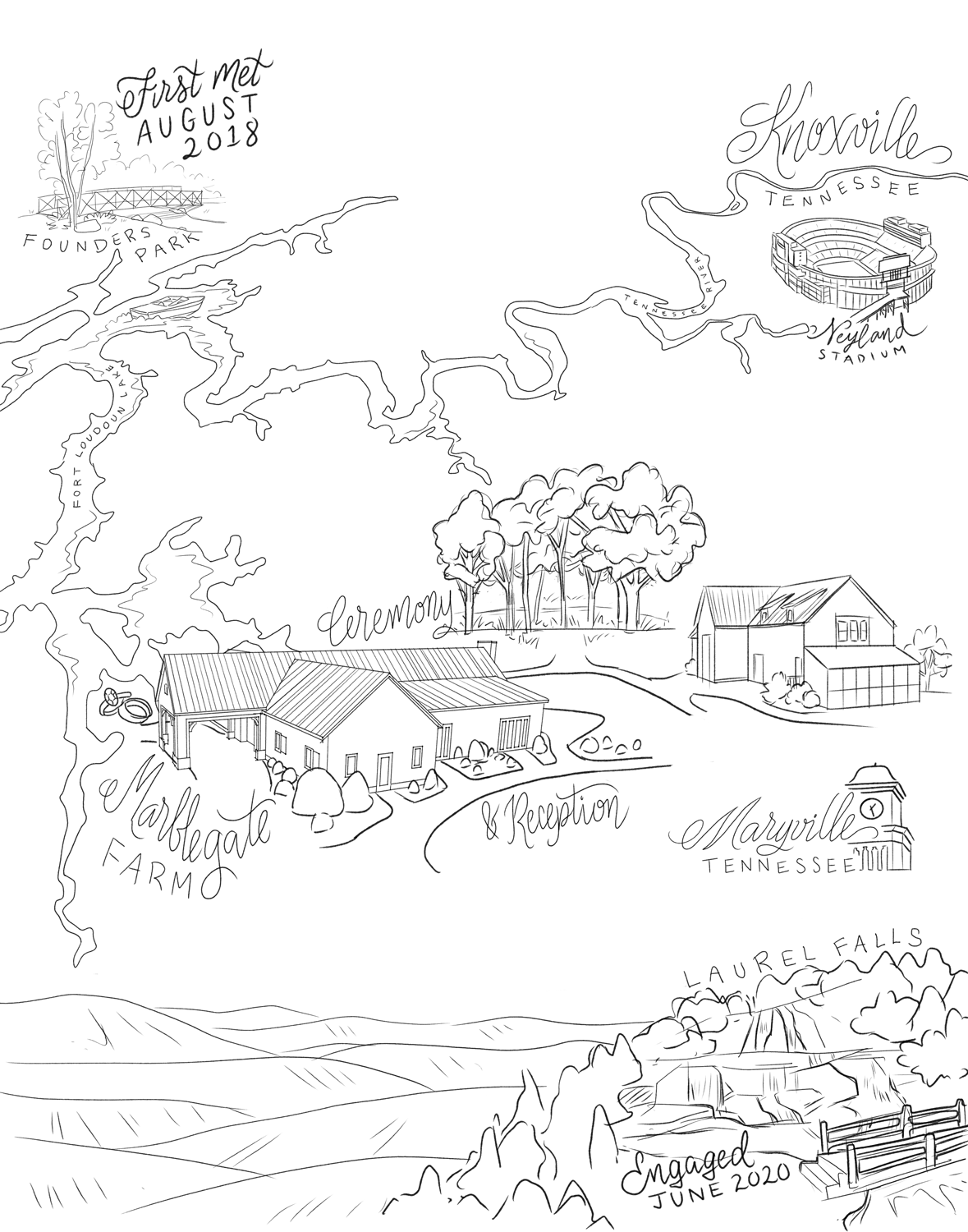
4. DRAFT ADJUSTMENTS
Corrections are made after getting feedback from the client. In this example a few small details were added and some were adjusted. Since there were no major changes, most of the initial draft was kept the same. If there are major changes, then I will likely redraw most or all of the draft.
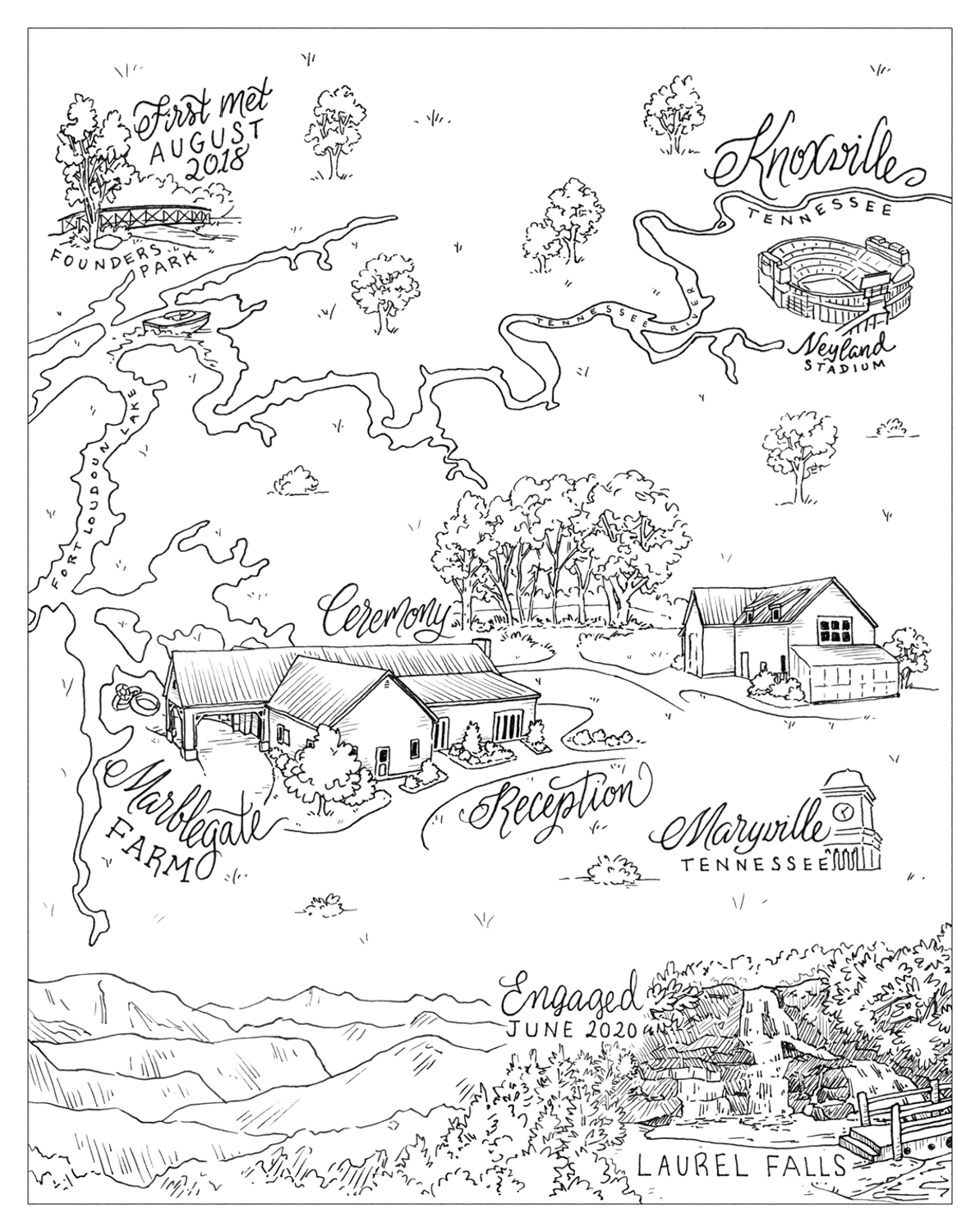
5. DETAILED DRAWING
Once the draft is approved, I go over the whole image and draw all the details. Sometimes I skip this step and go straight to the final if the draft was detailed enough. In this case, I wanted to get all the details correct and still be able to digitally adjust before going to the final.
Compared to the final image, this stage doesn't have the same line weight depth and shading detail. Wording is usually drawn with a felt pen instead of a steel nib, so it doesn't look as polished.
For the client, it is important at this step to make sure everything is perfect - especially spelling. Once this is approved the final is created, and while a digital copy can always be adjusted, the original hard copy if being mailed to the client can not!
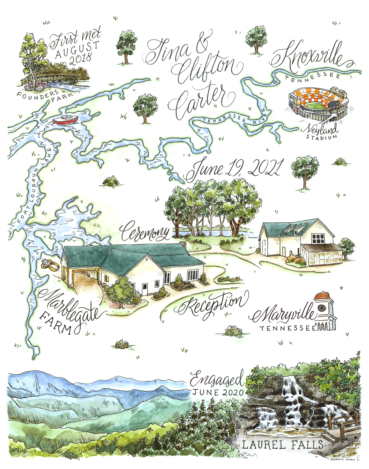
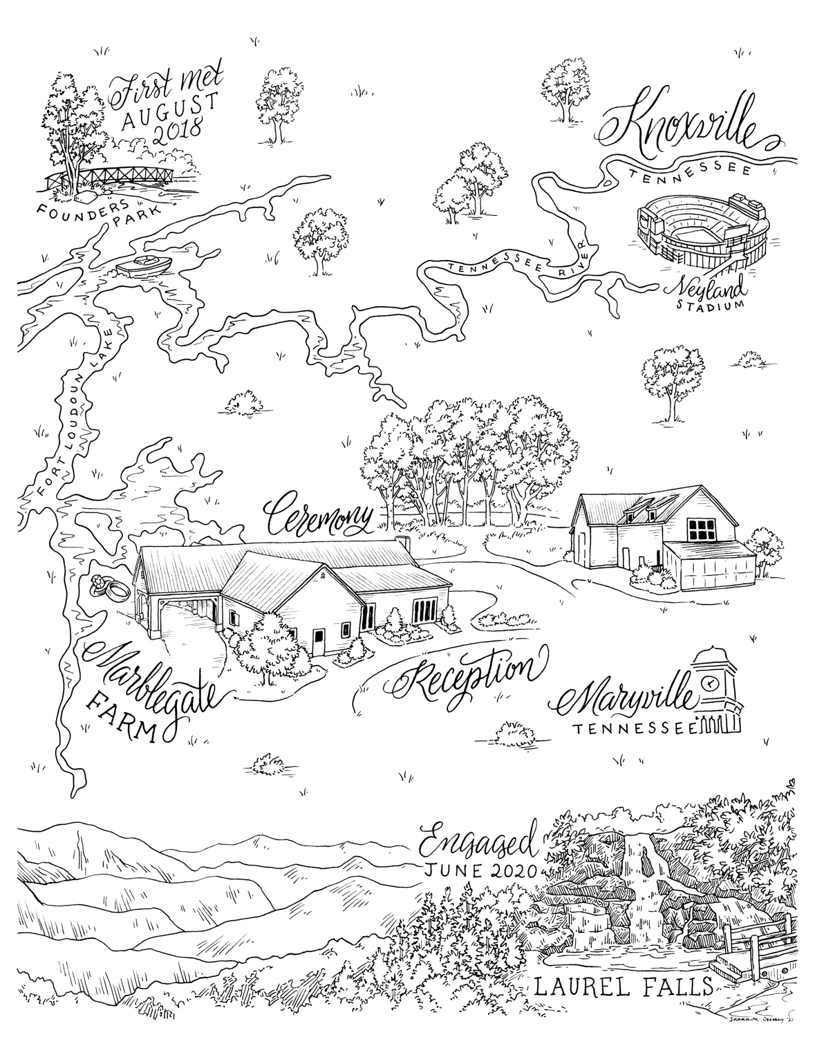
6. FINAL
The final image is created! Compared to the last image, you can see the text is polished with consistent line weights. The mountains did get more detailed, but all locations are basically unchanged. The difference is that, like the wording, the line weights are consistent since it is all drawn in once pass.
The client will first receive a high resolution pdf of the image via email. Optionally, the lines may be digitally colored for printing purposes - examples can be seen in the Maps gallery. If desired, the original hard copy is mailed to the client. It's a great memento of the event!
7. Color
Optionally, watercolor can be added to the artwork (if you let me know ahead of time!). This is a good option for printing in black and white and then having the physical art as a more colorful keepsake. Or for printing in color it ensures crisper details.